The Basics of Graphic Design Every Maker Should Know
BY : Sdreatech
21-Jun-2023

Graphic design uses text and graphics to convey a message in websites, logos, brochures, newsletters, posters, signs, and other visual communication. Designers use graphic design principles and elements to achieve their goals. Contrast is both an element and a principle—a visual characteristic and a technique.
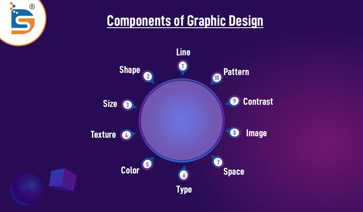
Components of Graphic Design
Lines, shapes, sizes, textures, values, space, and colors are also graphic design components. Graphic designers for print and the web use these elements. The goal is to grab viewers' attention and sometimes motivate them to act. Let's talk about components of graphic design.

1. Line
The most fundamental of the design components are lines. Line elements can be thick, thin, straight, curved, strong, or not solid. Lines define shape, organize information, convey emotions, and more. They create emotion, movement, and organization.
Your project is structured by print design grids' invisible lines. Visible lines, however, convey different messages. Every line may express numerous correspondences, so the project needs to determine which lines to use.
2. Shape
Shape elements are representations with borders. Graphic designers understand geometric and organic shapes for project design. There are two and three dimensions to geometrical forms. Connecting points with lines creates these shapes. The viewers identify shapes with emotions.
Thus, designers consider many factors when choosing forms for their work. Triangles and squares are the basic forms of geometry. They create decorative boxes, borders, and solid shapes. Shapes also include icons, symbols, and dingbats.
On the other hand, organic shapes have less consistency than other types. They come in both symmetrical and asymmetrical forms. Leaves, crystals, and other natural shapes are examples.
3. Size
In graphic design, size elements generally suggest value. The viewer usually notices particularly significant details first. A design element's size simply describes how big or small it is in relation to other elements in the design. In most cases, we will use size as a method to emphasize or call attention to a particular facet. But size becomes a much more effective design tool when combined with scale.
4. Texture
It refers to how something looks, such as how smooth, glossy, or rough it is. Visual texture is created by graphic designers using illusions to give viewers a sense of the way the thing will feel. Texture is a big part of designers' projects. Texture can serve as a background, enhance the overall appearance, and provide character to both type and images.
5. Color
The use of color is crucial for creating strong feelings in your audience. Graphic designers select colors for projects using color theory and the color wheel. Red, yellow, orange, green, blue, violet, and violet are examples of tertiary colors. Designers create these color elements by combining primary and secondary colors. Designers use two or more colors on the color wheel to create color harmonies. They also use different hues and shades to express emotions.
6. Type
It's crucial to use the right typography when choosing it for your project. The mood of your design depends on the font you choose. Designers also considered letter weight. Thick letters are typically used to convey important messages. Contrarily, thin letters are regarded as chic and contemporary.
7. Space
Space is essential for balancing visual elements and highlighting images and texts. Your design can look messy without enough space. Designers highlight visual elements with space. Negative space is the background, while positive space is the visual element. Therefore, designers work hard to balance negative and positive spaces.
8. Image
Graphic designers may use Photoshop or illustrations. To attract viewers, designs must be visually appealing. Images help create the design's mood and context. Therefore, designers must choose the right image to convey the brand's message.
9. Contrast
Contrast is created by putting opposite elements together, such as big and small or dark and light. Contrast can draw attention to design elements. Color, texture, type, and graphics can achieve contrast. Contrast describes a design's elements, especially adjacent ones. These distinctions emphasize certain elements. Designing for accessibility requires contrast. Text content, especially for visually impaired people, can be difficult to read with low contrast.
10. Pattern
Patterns are just multiple design elements repeated. Wallpaper is the most common pattern. On the other hand, designers can also use patterns to refer to predetermined standards for the design of specific elements. For instance, the vast majority of people who use the internet are familiar with the design pattern known as "top navigation."
Also Read | Color Perspective: The Impact of color meanings on your brand