Color Perspective: The Impact of color meanings on your brand
BY : Sdreatech
06-Apr-2023
When you're in business, whether you're just starting up in eCommerce, product design, or something else, you'll understand the color perspective: the impact of color meanings on your brand. Maybe you already know what colors to use, or you may be concentrating on setting up your business. But if you haven't taken it into account or don't know what hues to use, having an idea of color could be useful.
What is the study of hues?
The field of study known as color perspective: explores the effect of colors on our opinions, sensations, and behavior toward your brand. The study of color theory enables leaders to understand the rules of color schemes and create complementary combinations. Meanwhile, color perception examines our opinions and feelings about colors. Additionally, colors can attract users' attention, keeping them longer than monochromatic visuals. Consequently, colors strengthen the lasting power of UX/UI design.
Tips for sensible color choices when promoting/branding
- Must fit brand identity,
- Stand out from competitors,
- Easy to incorporate into branding.
Why does branding need a color personality?
Color affects mood. It elicits an emotion. Picking a poor color selection can damage your brand reputation, whereas good ones can enhance it. For instance, if the wrong colors are picked, your logo or material may be difficult to interpret and digest. When used by marketing companies, colors can impact consumers' ideas of companies and data. Shades help establish what's significant. and your business isn't any different. Brand colors can be make-or-break for your brand. Employing colors deliberately in your marketing can aid your viewers in seeing what you want them to do and recognizing your brand. This is why color psychology is beneficial for your marketing; it assists in branding your industry.
Poor color selections can damage your company's reputation, whereas good ones can enhance it. For instance, if the wrong colors are picked, your logo or material may be difficult to interpret and digest. When used by marketing companies, colors can impact consumers' ideas of companies and data. Shades help establish what's significant.
Meanings of shades
Let’s take a look at each meaning of shade to give you a better idea.
Psychology of the Red Color
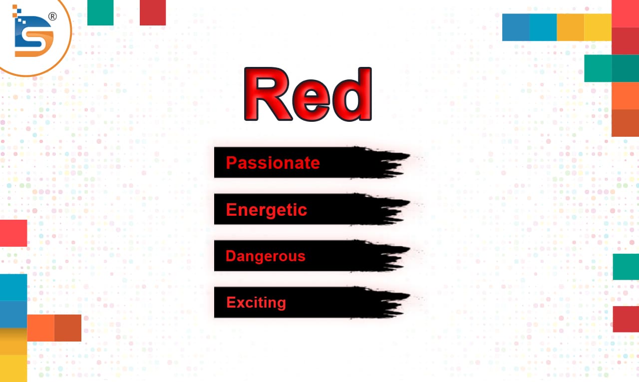
Red is an excellent choice for advertising. It can bring out passionate, energetic, dangerous, exciting, and active feelings. Red can elicit powerful emotions. So, when using it for branding, caution and limits should be taken into consideration. Top brands have proven good results with red in advertising. It's essential to exercise tact and restraint, as red boosts our emotional responses, which decrease logical thinking. As such, red is an effective color for marketing.
The price tags for clearance sales are colored red for a reason. Red's longest wavelength gives a deceptive visual impression. It is selected to spark emotions, thrill, and motivate. For successful businesses, a strong red is fitting. Softer tones of red ensure friendly branding.
Psychology of the Orange Color
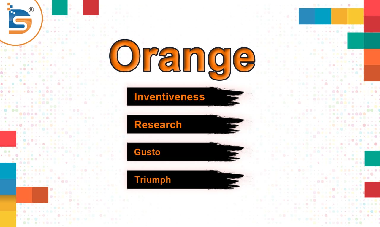
In color psychology, orange is a sign of inventiveness, research, gusto, triumph, and accord. The shade of orange injects a drop of color into any photo, webpage, or promotional material. Even though it draws attention, it doesn't have the same controlling bearing as red. Through its energy, it equalizes our mental and physical energies. Aside from enhancing certainty, oranges rouse thought and action, prompting us to judge our decisions and acknowledge the consequences of our deeds. It has lots of vitality and helps bring our mental and physical energies into balance. Orange stands for bravery, success, creativity, and vigor. It spurs us to show our chosen direction, face the consequences, and speak up. Orange can enliven a design or portray a fun image.
Psychology of the yellow color
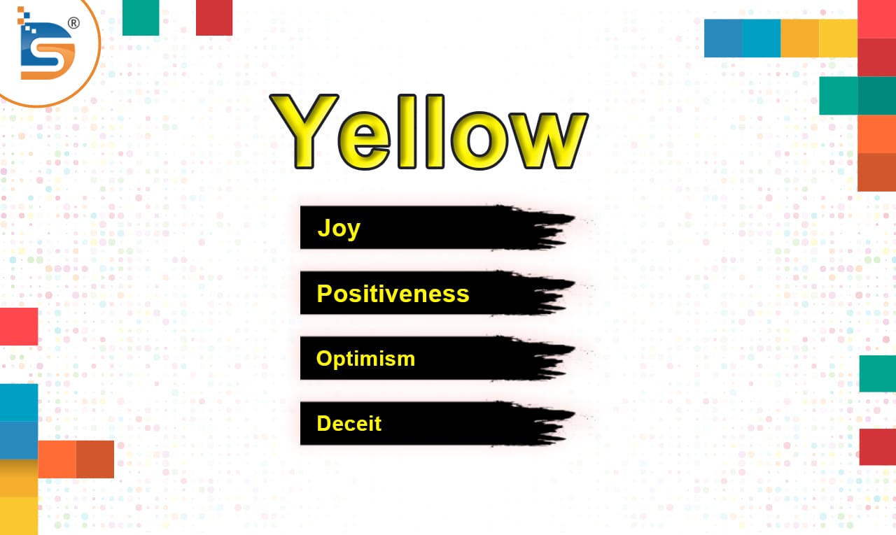
In color psychology for brands, yellow stands for sunshine. It brings joy, confidence, optimism, deceit, and precaution. A few companies use yellow as a website backdrop or border. It's a cheerful color, and introducing a bit of it to one's online store might assist customers in forming a good association with it. Yellow is a splendid choice for a brand, seeing as it gives people the feeling of contentment and the thrill of what is to come. Scientifically speaking, yellow stimulates rationality in us. It intensifies concentration, educational proficiency, and judgment.
Psychology of the Pink Color
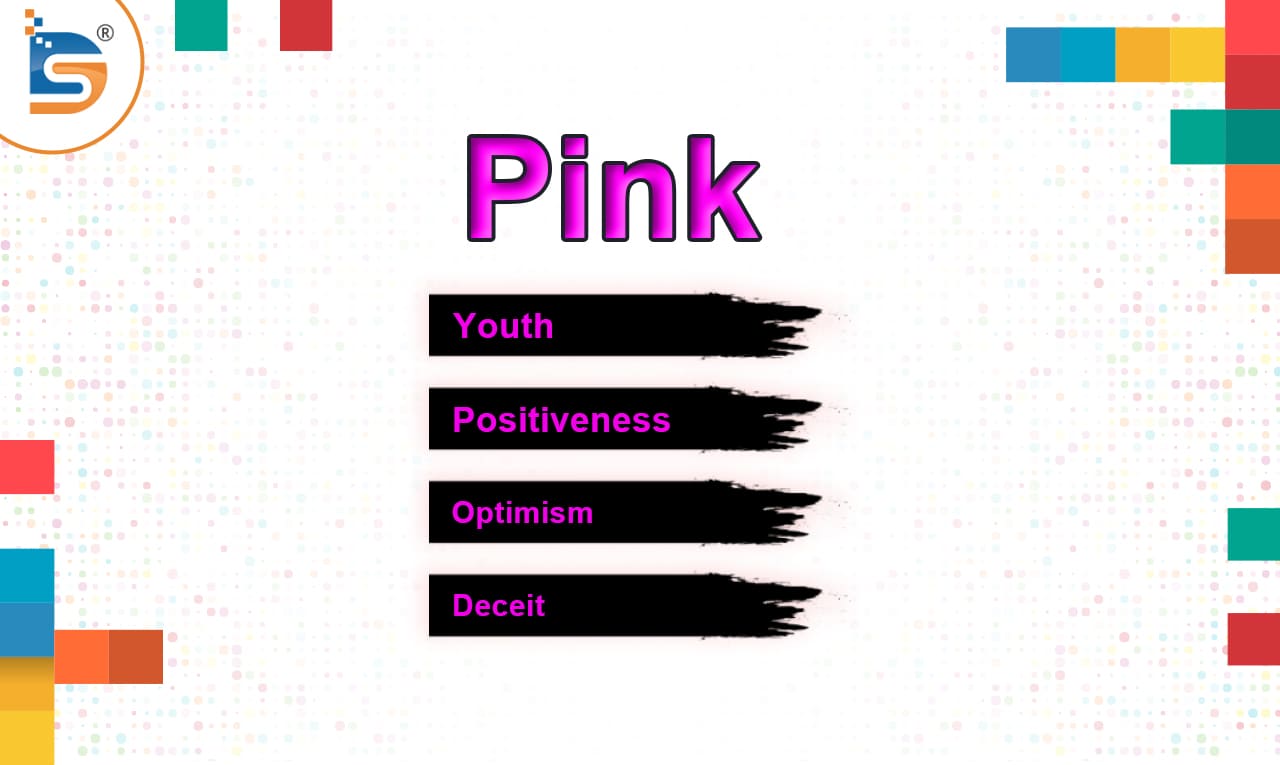
Pink is softer and warmer due to its combination of red's fire and Anderson's holiness. It reduces aggression, making it useful in detention cells. Its strong mood-stabilizing ability can be draining if it is exceeded. Lighter hues tend to create a calmer atmosphere, whereas darker shades increase emotion. It represents youth, health, and playfulness, plus it is frequently applied by firms targeting female consumers.
In color perception, pink conveys femininity, playfulness, immaturity, and unconditional love. Companies oftentimes use pink in their packaging, logos, websites, and messages, particularly for girls' toys. Additionally, a company's logo and packaging could enhance its feminine pink branding by using pink in the top nav and drop-down menus.
Psychology of the Green Color
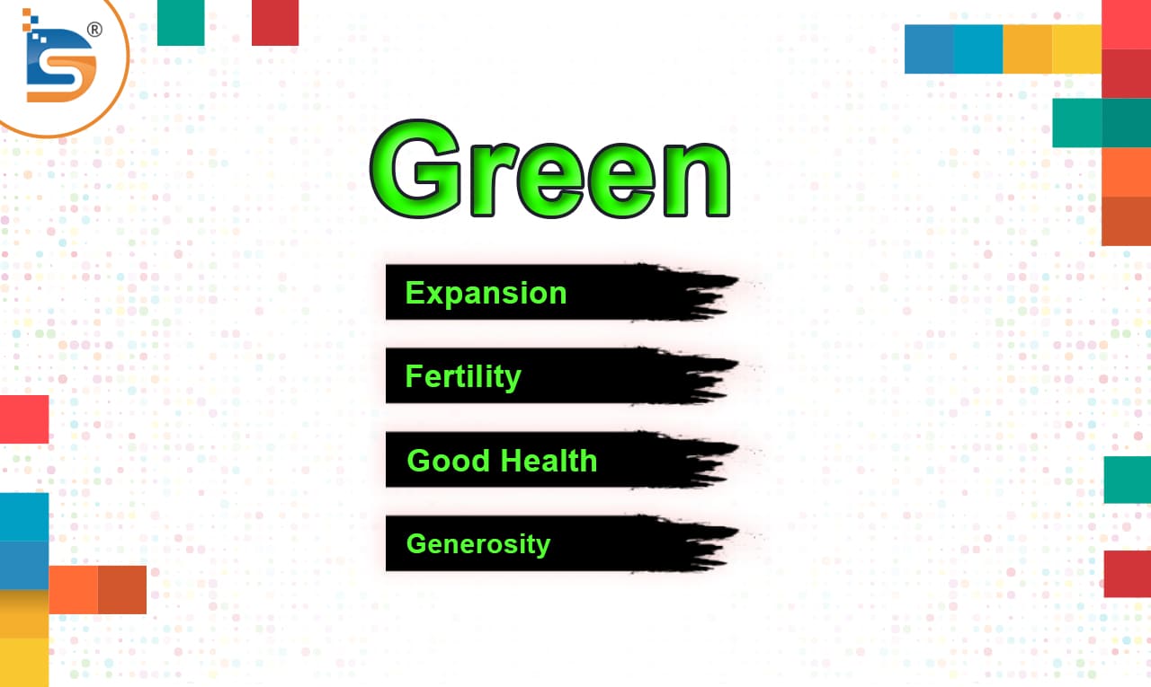
Green reflects character and wealth in color theory. The color has several positive connotations associated with it, including expansion, fertility, good health, and generosity. According to psychology research, colors affect moods and emotions. These responses can occasionally be linked to the saturation of a color. In other situations, they are the culmination of a lifetime of experiences and exposure to various aspects of culture. If you sell health and fitness products, you might want to incorporate more green into your online store.
Psychology of the Blue Color
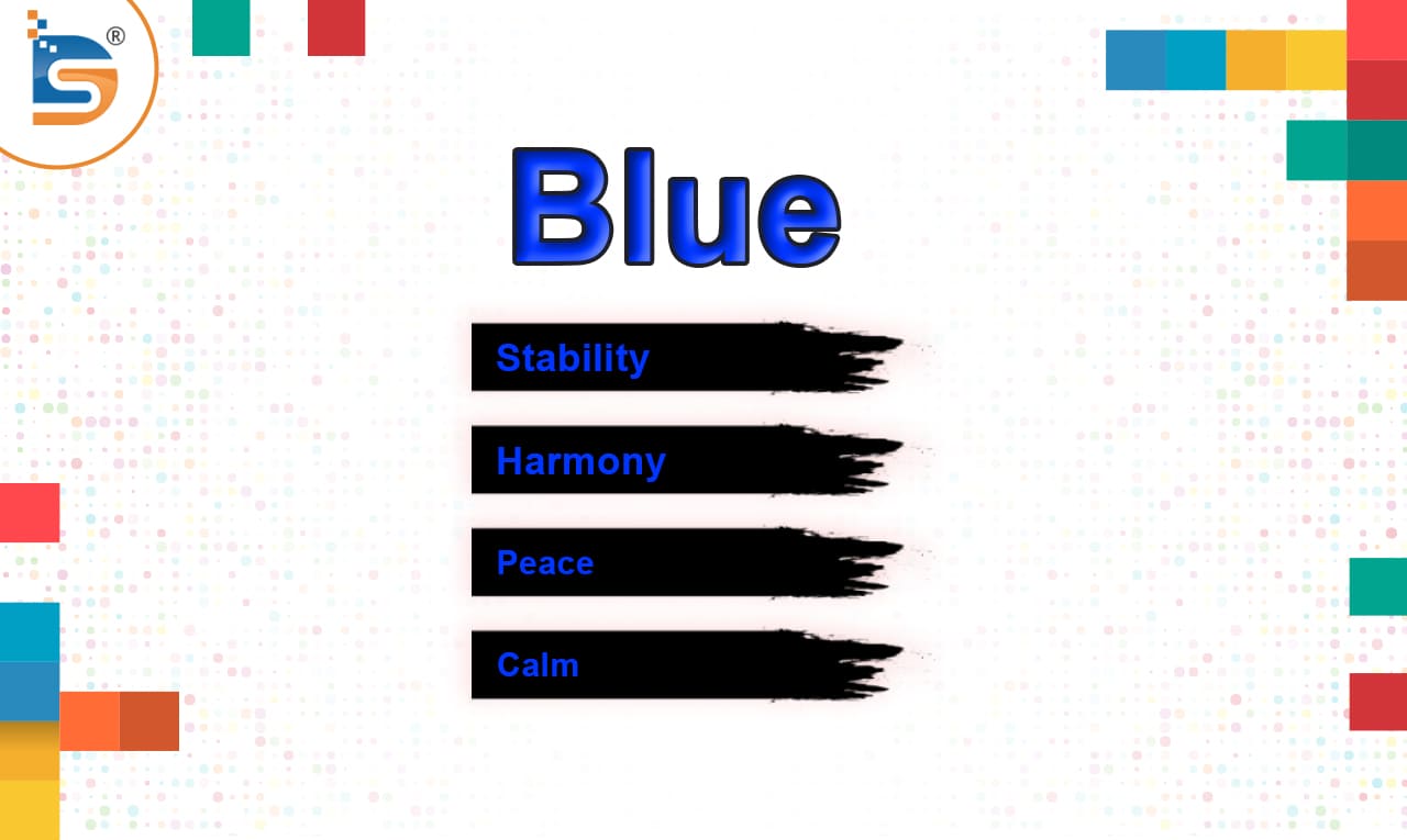
Blue has a strong connection to the sky and the sea in color psychology. When you use blue in your branding, customers may associate your brand with stability, harmony, peace, calm, and trust. However, blue can also mean anxiety and coldness. The logo and top navigation of your website can both use the color blue. Some retailers use the blue color associated with trust to highlight their guarantee, trust certification, or free shipping icons. Blue's popularity makes it seem conservative and non-threatening. Blue evokes calmness and relaxation. It is frequently characterized as calm, undisturbed, protected, and well-ordered. Stability and reliability are associated with blue. Companies that want to appear secure use blue in their advertising and marketing. Blue may make you feel melancholy or distant.
Psychology of the Purple Color
People usually think that different colors make them feel different things, but this can vary a lot from person to person and from culture to culture. Purple, like other colors, evokes different emotions and associations. Purple in color psychology signifies royalty, wisdom, power, and spirituality. However, overuse of the color can lead to frustration. Additionally, it may be a symbol of wealth, extravagance, peace, pride, and independence. Purple, like other colors, is a focus of color psychology, which contends that hues can have a significant influence on feelings and even actions. While the remainder of the website on Hallmark makes use of all other shades, the logo, and top navigation are both purple.
Psychology of the white color
In color and psychology research, white exemplifies sincerity, wholesomeness, cleanliness, and modesty. White's meaning often depends on context. Color is frequently used in marketing, fashion, and interior design because there are numerous ways to use it to evoke particular feelings or achieve particular result sets in fashion and interior design. After all, there are numerous ways to use it to evoke particular feelings or achieve particular results. White can have the opposite connotation in certain regions of the world. Based on your target audience, remember this. White symbolizes freshness, quality, and coldness. White is typically the color that is utilized the most on an online store's website. It will undoubtedly be your product photo background. Your pages will probably be white with black text. This is because the most readable color combination for text is one that consists of black text on a white background.
Psychology of the black color
Brand color psychology, Black has a meaning that is symbolic of elegance, sophistication, power, and mystery in a business logo. On the other hand, the meaning of a color can also elicit feelings such as anger and melancholy. The logos of many fashion retailers are black. Because it's easy to read, black is a popular text color. For website consistency, some brands use black-and-white culture advertisement photos or symbols. Usually, a brand's dominant color matches its beliefs and character.
In business, color is important, so it's important to understand black's pros and cons when designing logos in black. The color black can have a surprising amount of mythology. Black, often called "basic black," can be deceptive and have hidden meanings. In addition to these connotations, it is also linked to affluence, success, seduction, and high-end luxury brands. Black logos express concepts, unhappiness, and shrewdness and signify durability. Black packaging is elegant and powerful. They don't need to draw attention to themselves. They may think their reputation conveys power, stability, and value, so they don't need colors.
Summary
Now that you recognize shades of cognition and the most common shades' concept for each hue, it's time to apply it to your business. While there are common colors used in many niche areas, including blue for medical services, you shouldn't always comply with them. Think about using colors that show what your brand stands for or how you want people to feel when they shop at your online store.


